Copy
Illustration: The Public Domain
View this email in your browser

Every once in a while, a commission makes me smile even more than usual. And David from the NoSleep Podcast asking me if I'm up to do artwork for the season finale makes me smile so hard my face hurts.

The season finale of season 11 was even more of a nice surprise than usual, because not only did it feature multiple stories, but the main story (which the team asked me to focus on) was written by Henry Galley, one of my favorite NoSleep authors and a personal friend.

So, before I talk about the process a bit more, let me first present my artwork for The Public Domain:

View full size

Making use of the Public Domain

Henry's story revolves around, without giving away anything too important for the story, characters from the Public Domain coming to a dangerous mockery of real life. Featuring characters that were not copyrighted anymore, the story awarded me with an awesome opportunity: I could actually do a kind of fanart and draw depictions of well-known characters in my style!

The first step in my art process involved, as it always does, research. So I sat down with a nice cup of coffee and visited Project Gutenberg. After giving it some thought and getting input from my girlfriend, I settled on the characters of Robin Hood (from "The Merry Adventures of Robin Hood"), Alice (from "Alice's Adventures in Wonderland") and Sherlock Holmes (from "The Adventures of Sherlock Holmes").

My goal was to find the author's original description of their respective characters. I wanted to find a balance between those descriptions (to stay true to the source material) and the way they are usually depicted in popular culture (to make them more recognizable).


Shading with text

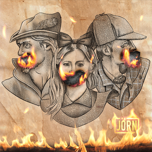
While I was working on my first character, Alice, my girlfriend and I came up with an awesome idea: Why not use layers of text to create the faces? To try that out, I copied huge chunks of the original text into Photoshop using a small font size and used the layer mask feature to make them appear in certain places.

This enabled me to basically "paint" with text! By layering different passages of the source material on top of each other, so that the letters of one text fill out the spaces of the other, I could achieve the look of a darker shading while I used another layer written in a white font to create highlights.

If that sounds convoluted, that's because, well, it kind of is! So I recorded a little video to explain it better.

Enjoy!

Copyright © 2019 The Art of Jörn, All rights reserved.


Want to change how you receive these emails?
You can update your preferences or unsubscribe from this list


This email was sent to <<Email Address>>
why did I get this?    unsubscribe from this list    update subscription preferences
The Art of Jörn · Schenkspfad 4 · Cologne 51105 · Germany

Email Marketing Powered by Mailchimp